
CLIENT WORK · BRAND IDENTITY · VISUAL REFRESH
TUMU'S LODGE
Refreshing a hospitality identity while keeping its roots intact.
TuMu's Lodge needed a more cohesive visual identity that could grow across signage, apparel, merchandise, and digital use without losing the warmth and character of the original brand.
rooted in warmth, place, and belonging ♡
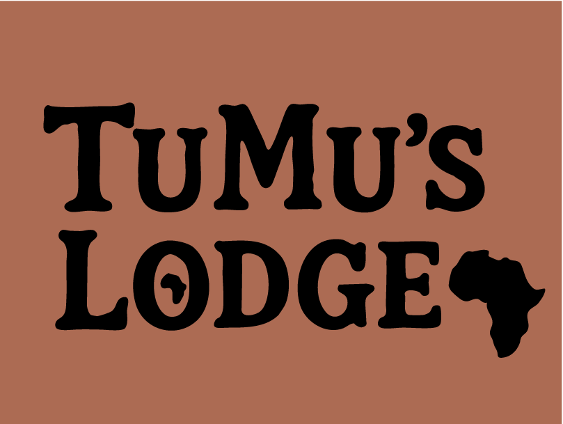
familiar,
grounded,
and more
flexible.
keep the spirit.
refine the system.
The
Project
The goal was not to erase what already existed. It was to help it grow.
The original TuMu's Lodge identity was decorative, welcoming, and full of personality. That charm became the starting point for the redesign rather than something to move away from.
The refresh focused on simplifying the overall system, strengthening the typography, and developing a visual identity that could work more consistently across physical and digital applications.
Starting with
what was already there.
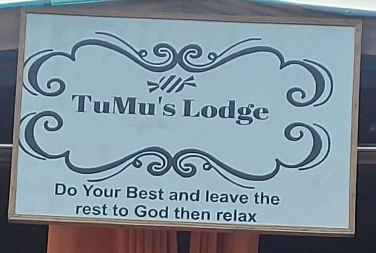
The original mark had warmth and personality, but it struggled with consistency and scalability.
Decorative flourishes, multiple visual elements, and the existing type treatment made the identity harder to reproduce across apparel, merchandise, signage, and smaller digital spaces.
That meant the redesign needed to feel cleaner without becoming generic.
Same place.
Clearer identity.
BEFORE
AFTER
Logo
Redesign
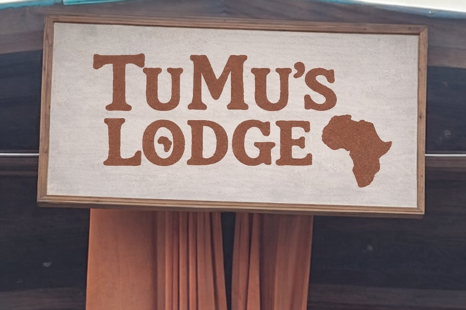
A stronger structure gave the identity more presence without losing its sense of place.
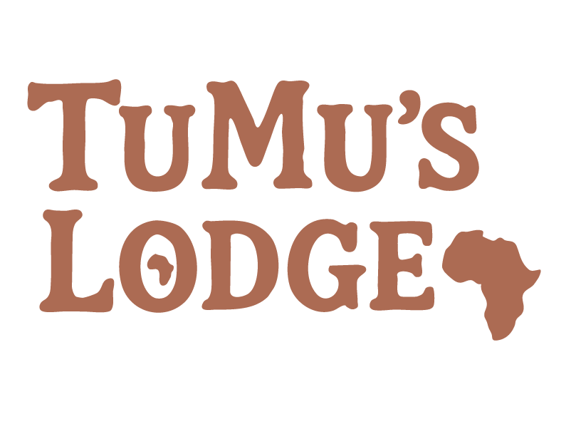
The updated typography uses a stronger serif structure that feels established and enduring, while simplified forms make the logo easier to apply across different formats.
The Africa silhouette helps maintain the geographic context of the brand while becoming part of a more controlled and repeatable system.
One identity,
multiple uses.
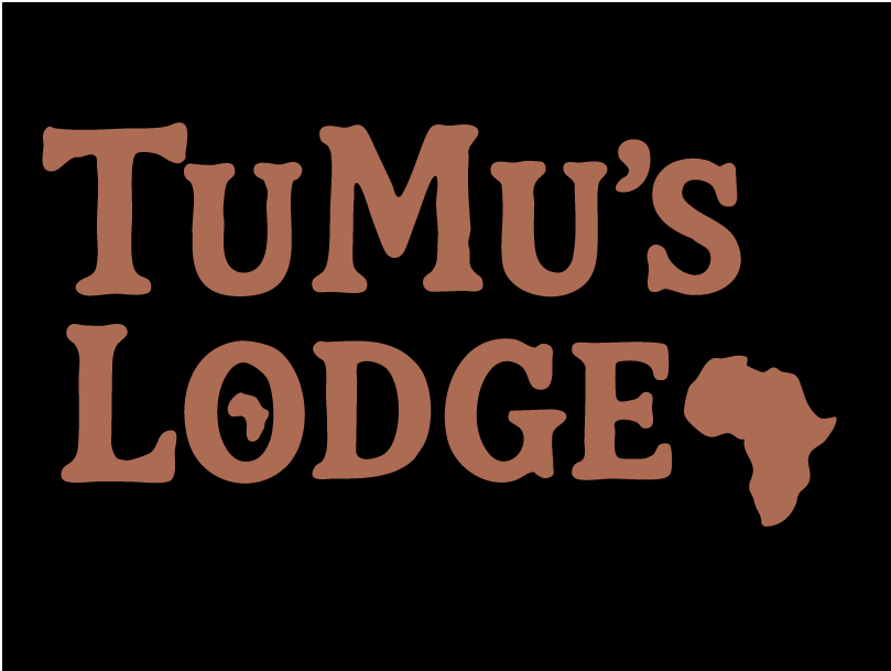
Multiple logo variations allow the brand to remain recognizable across signage, apparel, promotional materials, merchandise, and digital applications.
The refreshed
visual language.
Warmth
Earthy tones and natural references reinforce the welcoming, grounded feeling of the lodge.
Structure
A more controlled logo system makes the identity easier to reproduce across real-world applications.
Clarity
Simplified visual forms help preserve character while making the brand more versatile.
Earthy by
nature.
The palette takes its cues from the physical environment: warm wood, clay, sand, soft plant tones, and deep earthy neutrals.
Designed for
a real
place.
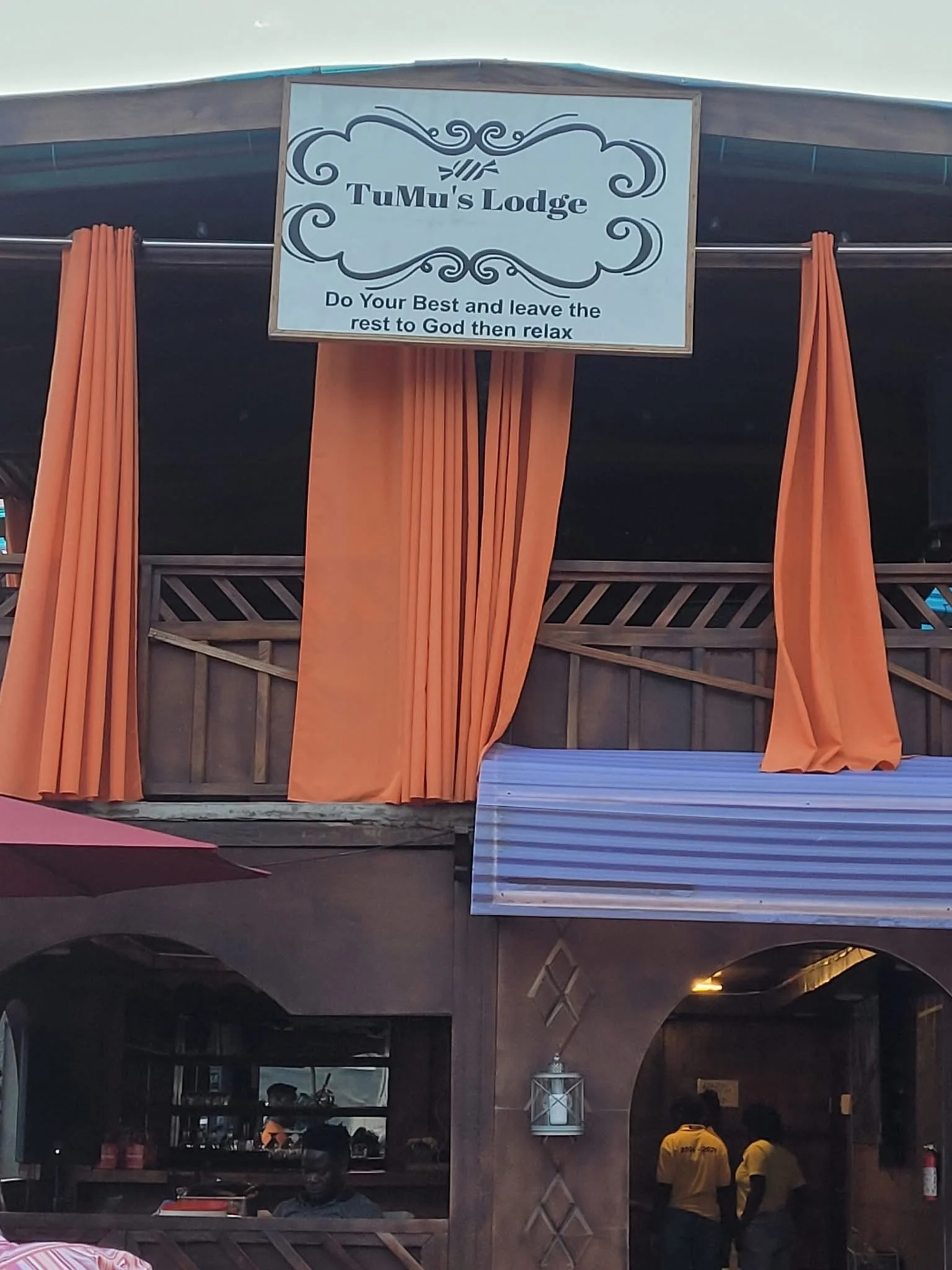
The identity needed to feel like it belonged to the lodge itself.
Working from the existing environment helped guide the redesign toward something warm, grounded, familiar, and practical rather than overly polished or disconnected from the space.
a brand should feel at home where it lives ♡
PROJECT SCOPE