Dozer House Production
Logo Design · Visual Identity · Client Branding
Initial Client Concept
The client wanted a logo that clearly displayed the name Dozer House by combining a house and a camera into one cohesive symbol. It should be literal and easy to recognize, with an unmistakable connection to film and photography. The house element represents a creative home base and sense of belonging, while the camera emphasizes the production and visual storytelling side. They asked for a bold, simple mark that performs well online, on merchandise, and in promotional materials. Overall, simplicity and clear, standalone iconography were prioritized to ensure instant legibility and versatile use.
Design Translation & Interpretation
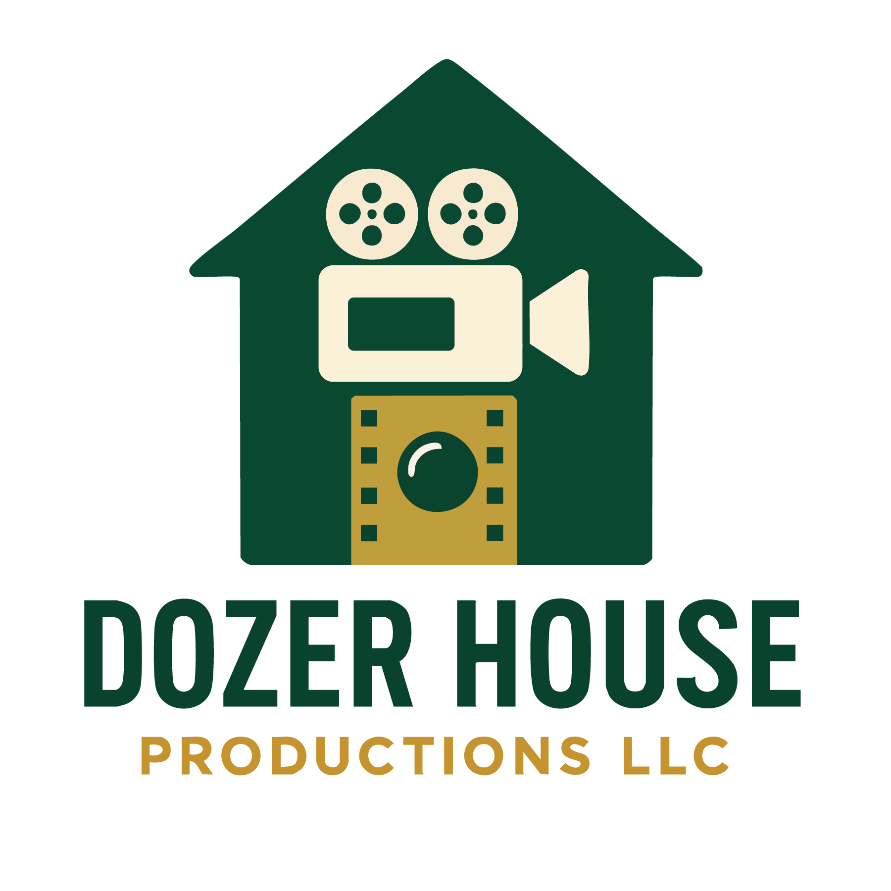
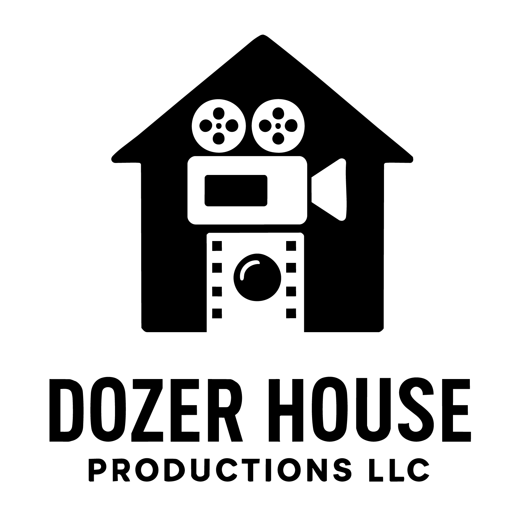
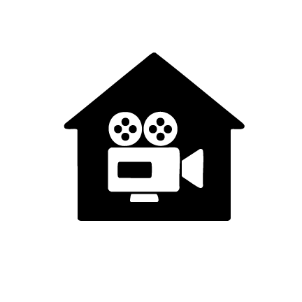
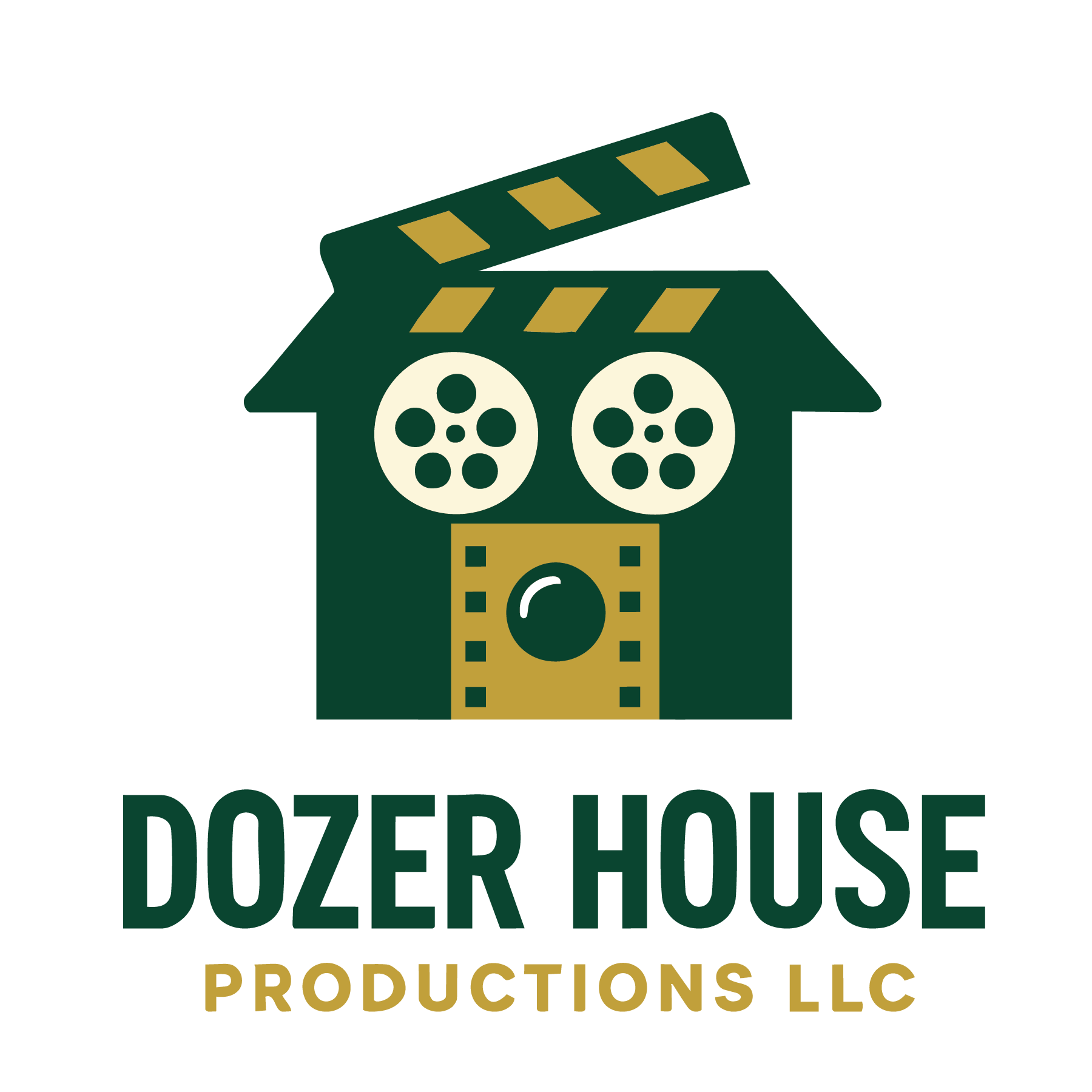

Building from the client’s original concept, I translated these ideas into a cohesive visual system by refining the shapes, balancing proportions, and creating multiple logo variations. The final direction maintains the client’s vision of a house-camera hybrid while improving scalability, readability, and overall brand consistency. Multiple versions were developed to ensure the logo could function effectively in color, black and white, and simplified formats depending on the application.
Dozer House Productions
Capturing moments, telling stories, and delivering high-quality visual experiences through photography, videography, and creative media.
From events to branded content, Dozer House Productions brings ideas to life with intention and precision.
Explore their work:
👉 https://www.dozerhouseproductionsllc.com